Best Practices for Tooltips in Data Visualizations from Opattern
Many data visualization style guides omit guidance on creating effective interactive or animated visualizations. One exception is the section on Tooltips in the Opattern design system guide, built by the design and user experience firm Opower UX.
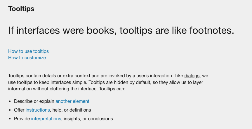
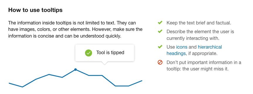
The Tooltips guidance is fairly short, but useful. They tell the user what tooltips are and how they are–and are not–used. I also appreciate that they encourage users to think beyond standard text tooltips and to consider how “images, colors, or other elements” might populate a tooltip. The warning is also important: “Don’t put important information in a tooltip: the user might miss it.” Over the last several years, we’ve seen a pullback from putting too much important information in tooltips for this very reason–people go quickly and don’t always click–so make sure important information should be included in the main visualization and not buried in tooltips where users may not find them.
Opower UX: https://ux.opower.com/opattern/
Written by Jon Schwabish