Anatomy of a Good Chart: GitHub’s Approach
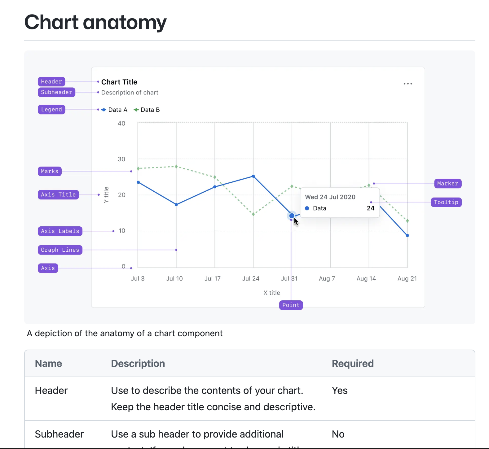
GitHub’s dataviz guide does what most style guides are too shy to do: it names every part of a chart and stamps it “required” or “optional,” then backs that up with enforceable rules like what charts are allowed (bars, lines, areas, progress) and what aren’t (no donuts, no sparklines), plus limits on series and categories, minimum line widths, stroke/marker differentiation, and explicit contrast thresholds for text and marks. It essentially integrates a checklist into its guidelines that all teams can test.
By narrowing choices and standardizing anatomy, GitHub reduces reader load and indecision in one shot. These constraints scale across products and squads because they’re specific enough to be encoded in components, yet simple enough to learn.
Written by Max Graze