Elevating Table Design: Lessons from the Cato Institute’s Data Visualization Guide
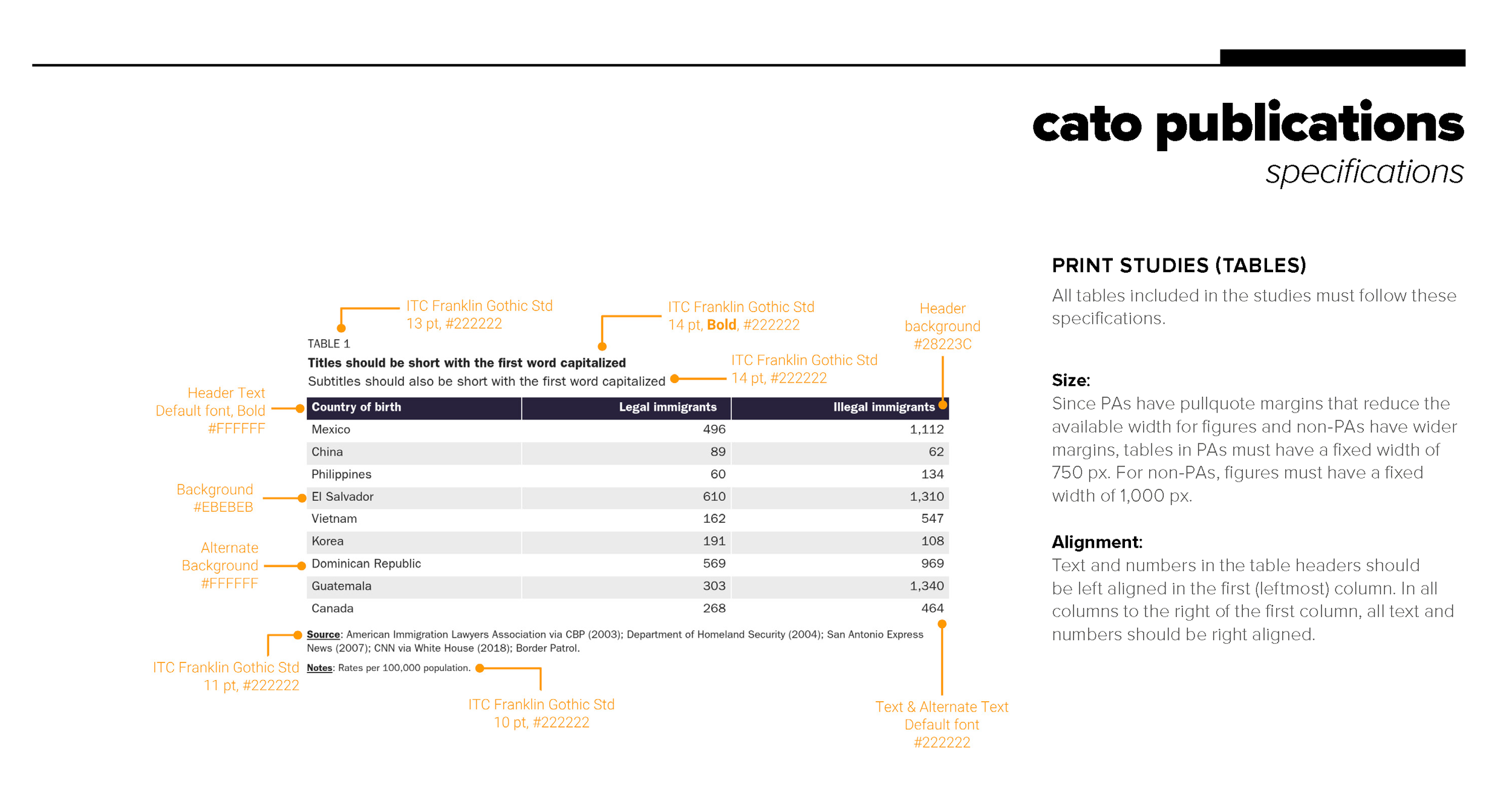
There are few types of visual communication more overlooked than tables. They’re not as cool or as visual as bar charts, line charts, or scatterplots. But maybe–just maybe?--they are the most common way to communicate data. The Cato Institute’s data visualization style guide includes a few pages on table design, one set for print (PDF) products and another for web/blog products.
In the guide for print (PDF) tables, they define the overall width of the table, along with which fonts and font sizes should be used. They also detail the colors of all fonts and the background color for the title banner and body stripes. They also make a good point about aligning text and numbers on the right side of the image.
It’s worth noting, though, that the orange color (Hex code #ED8B00) on the white background does not meet color contrast accessibility guidelines; they could have used either of the purple colors in the guide (#28223C or #716ABA) to create a more accessible version.
Written by Jon Schwabish