The Rare Exception of Omitting Interactive Chart Guidance in Data Visualization Style Guides
Somewhat surprisingly, a lot of the data visualization style guides we’ve reviewed as part of this project do not include a lot of guidance on creating effective interactive or animated charts. Maybe it’s because there are so many variations on what can be done with an interactive visualization–from different kinds (and content of) tooltips, to hover and click styles, to vertical or horizontal scrolling.
The Office for National Statistics in the UK is the rare exception. Filed under “Advanced formats” with Dashboards, ONS includes an entire section on “Interactive charts and animations.” The guide lists the various ways users can interact with a graph (e.g., scrolling, hovering, input box, etc.), when to use an interactive chart, and some basic tips for creating interactive charts.
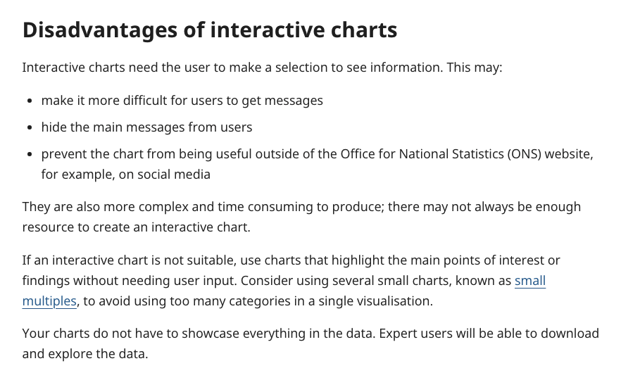
They are also careful to include a section on the disadvantages of interactive charts. It’s great how explicit that interactive charts force the user to make choices to see information, so such graphs may make it harder for users to get the main message or they may hide the main message from users. No graph is perfect, so it’s always good to be reminded when certain graphs are useful for the user.
Written by Jon Schwabish