
Data visualization style guides are standards for formatting and designing representations of information, like charts, graphs, tables, and diagrams.
Data viz style guides often include explaining the what (e.g., types of charts), the why (e.g., reasons for using specific colors), and the how (e.g., tools or templates). Data visualization style guides can also fit within an organization’s larger design system and include how other guidelines, like brand standards or editorial guidelines, apply to data visualization. For example, they might specify how elements like a logo, brand colors, and language tone specifically apply to charts, tables, and diagrams.
Articles

What Are Data Visualization Style Guidelines?
by Amy Cesal
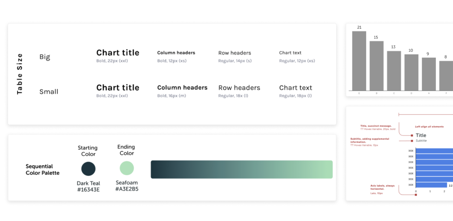
Core Dataviz Style Guide Components
by Maxene Graze


Developing Annual Surveys for Data Viz Style Guides
by Maxene Graze

Why Your Organization Needs a Data Visualization Style Guide
by Jon Schwabish

A detailed guide to colors in data vis style guides
by Lisa Charlotte Muth
Videos
Who we are
Amy Cesal is a freelance information designer and strategist. She consults with organizations to help them build data viz practices including data viz style guides. Amy is a co-founder of the Data Visualization Society and a 3x Information is Beautiful award winner. She holds a Master's Degree in Information Visualization from MICA, where she is an adjunct professor. She has pioneered the use of data visualizations style guidelines, and writes and speaks on the topic. Website | LinkedIn
Jonathan Schwabish, PhD is a Senior Fellow at the Urban Institute and is an economist, writer, teacher, and creator of policy-relevant data visualizations. He is considered a leading voice for clarity and accessibility in how researchers communicate their findings. Dr. Schwabish helps nonprofits, research institutions, and governments at all levels improve how they communicate their work and findings to their partners, constituents, and stakeholders. LinkedIn
Alan Wilson is a Principal Designer at Adobe. As an Experience Design Leader, he works with his team to keep the Adobe Marketing Cloud looking good. This includes everything from the UI and icons to component behaviors and patterns. But his biggest endeavor is to make data easier to understand through the effective use of data visualization and machine learning. LinkedIn
Maxene Graze With a background in biological and linguistic academic research, Max Graze has an interdisciplinary approach. By day, she's a Senior Data Visualization Engineer at King. By night, she explores innovative methods in data visualization, including multisensory representations that combine visual, auditory, and haptic stimuli to enhance understanding and engagement with data. Her work aims to bridge the gap between human experience and data analysis. LinkedIn